Exericse Data.3
Matplotlib can be used to make plots. In this exercise, we merely try a few simple examples.
As initial setup, if you’re using IPython notebook, first type %pylab inline. Then, perform the following import:
>>> import matplotlib.pyplot as plt
>>>
(a) Make a pie-chart
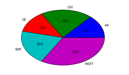
In the previous exercise, you created the following dataframe using Pandas:
>>> totals = portfolio.groupby('name')['shares'].sum()
>>> totals
name
AA      100
CAT     150
GE       95
IBM     150
MSFT    250
Name: shares, dtype: int64
>>>
Turn it into a pie-chart as follows:
>>> plt.pie(totals, labels=totals.index, autopct='%.0f%%')
>>>
This should produce a chart that looks something like this:
Okay, that was easy enough.
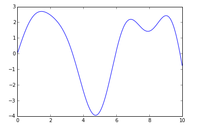
(b) Plotting a Math Function
Let’s make a plot of a math function:
>>> import numpy
>>> x = numpy.arange(0, 10, 0.01)
>>> y = 0.2*x*numpy.cos(2*x) + 3*numpy.sin(x)
>>> plt.plot(x, y)
>>>
This should make a plot like this:
(c) More examples
To do anything more complicated with Matplotlib, the next stop should be the Matplotlib Gallery.